Share
When monitoring your cloud environment in Cloud Insights, you can make your dashboards as specific or general as desired. The more you define an area or issue to illustrate, the easier you’ll find it to create the widgets in the dashboard that tell that story. The diversity of widgets and settings available to monitor your environment in Cloud Insights allow for flexible fine tuning. In turn, you can display information that tells the story in detail.
Often, you want to focus on one object, a VM, for example, to get a broad 360-degree view on how it is working, and if it is performing well or having symptoms of issues, such as high latency.
If you separate out the metrics for this single object and view them with the same time range across all graphs, you’ll be better equipped to quickly understand its condition.
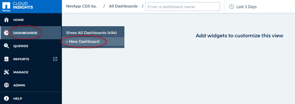
Creating a New Dashboard in Cloud Insights
To create your new dashboard, choose “Dashboard” from the menu on the lefthand side of the page; from there, choose “+ New Dashboard”:
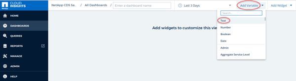
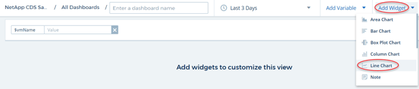
Once you’ve created a new dashboard, you can add a variable to easily control the context of the entire dashboard. In this case, select “Text” to name the VM.
Once a text variable type is chosen, a window appears at the top left of the new dashboard with a default variable name (“$var”); in this example, we changed that name to “$vmName”.
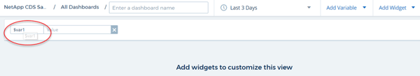

This variable will be used in the “Name” filter of every widget we’ll create, so changing the variable at the top of the page updates all widgets on the dashboard. With this variable, we can quickly fill out the entire dashboard and immediately inspect any VM by pasting its name into the variable.
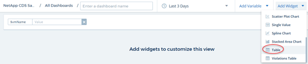
We’ll add a lister of VMs using a Table Widget, so that we have a selection panel of active VM names; here is how we create that table:
We need to enter the following settings, including “Hypervisor OS” and “Power State”:
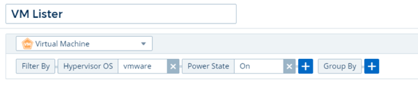
In the settings above, we filtered for VMware VMs by specifying the OS in the “Hypervisor OS” category (it could also be AWS or Azure, for example). We also filtered for VMs that are powered on only.
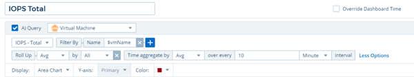
Let’s add some time series widgets that will display each aspect of the VMs performance over a user defined time period. First, let’s create a “Line Chart” time series widget for IOPS:
In the figure below, we’ve named the widget and set the type of object to “Virtual Machine”. We filtered by the name of our variable (“vmName”) and set the color of the graph to magenta:
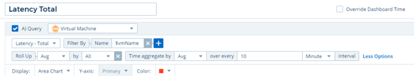
We’ll complete the rest of the time series widgets in the same way:
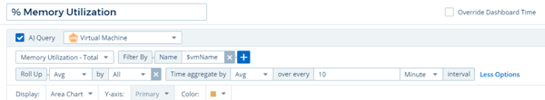
Memory Utilization:
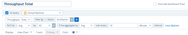
Throughput:
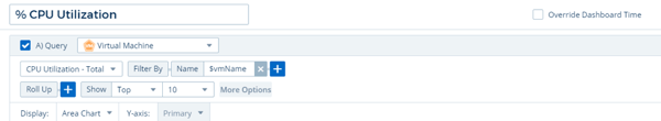
CPU Utilization:
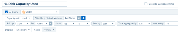
Disk Capacity Used:
Datastore Latency:
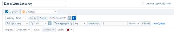
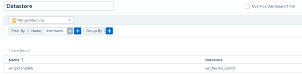
In this last widget, we are filtering by something other than the “vmName” variable name; in this case, we filtered by the datastore name that the VM is located on. Because this name has nothing to do with the VM name (since many VMs are on the same datastore), we need to understand the name of the datastore. In this case, we’ll use another table widget to find out the name of the datastore the VM is on. We’ll then enter that name in the “Datastore” widget above.
Here is the table widget that will list the VM’s datastore name:
Here is what the Dashboard looks like when the above widgets are created and placed on the page. On the dashboard below, we’ve browsed the table list of VMs and chosen a VM. Copying and pasting that VM name into the variable at the top updates all the metrics and graphs to illustrate that VM’s condition or state. We’ve chosen different colors for each graph to create contrast and resized and arranged the widgets to fit on a single screen:
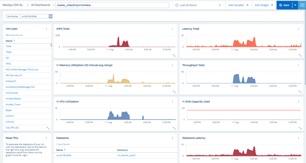
This example dashboard is quick to create and will display the metrics for VMs consistently. You can use this technique to filter different aspects of your environment in dashboards, in a variety of ways, to quickly focus on specific areas of your infrastructure.
Learn More About Monitoring Your Cloud with Cloud Insights
Visit Cloud Central today to learn more and to signup for a free trial.